The Wing Luke Museum - Website Redesign
A Museum Like No Other
The Wing Luke Museum of the Asian Pacific American Experience
ROLE
UX/UI Designer, UX Researcher
TEAM
UX Designer & Researcher - Olivia Shin
UX Designer & Researcher - Fran Urmatan
TIMELINE
August 2022 to January 2023
TOOLS
Pen & Paper, Figma, Mira, Zoom, Microsoft Teams
METHODS
Survey, Heuristic Evaluation, Web Analytics, Competitive Analysis, Comparative Analysis, User Interviews, Affinity Mapping, User Persona, User Flow, Site Map
OVERVIEW
The Wing Luke Museum of the Asian Pacific American Experience is a history museum in Seattle, Washington, United States, which focuses on the culture, art and history of Asian Pacific Americans. It is located in the city's Chinatown-International District. Nationally recognized for their work in creating dynamic, community-driven exhibitions and programs.
The Wing Luke Museum offers an authentic and unique perspective on the American story. From the struggles of early Asian pioneers to accomplished works by national Asian American, Native Hawaiian, and Pacific Islander (AANHPI) artists, their contributions give us a look at what it means to be uniquely American.
MY ROLE
In August 2022, I was looking for an opportunity to contribute to the AANHPI community.
As a UX/UI Designer and UX Researcher for the Wing Luke Museum, I was able to do just that. Throughout the discovery phase, I developed a thorough understanding of our users, their motivations, needs and pain points through qualitative and quantitative studies. I created user experience artifacts such as user flows, site maps, wireframes and low-fidelity sketches to help guide the design process. Working with two other UX Designers, we conceptualized usable, valuable, consistent and intuitive user experiences by considering industry and competitor trends, visitor feedback, and usability. Our goal was to make the Wing Luke Museum more accessible, user friendly, and informative for visitors.
“We connect everyone to the dynamic history, cultures, and art of Asian Americans, Native Hawaiians, and Pacific Islanders through vivid storytelling and inspiring experiences to advance racial and social equity.”
— The Wing Luke Museum Mission
Research
User Interview Insights
When possible, I conduct remote interviews over Zoom with subject matter experts or users of our product. I prefer to kick off the research process with user interviews because it helps align everyone on the team and check assumptions we all might have at the door.
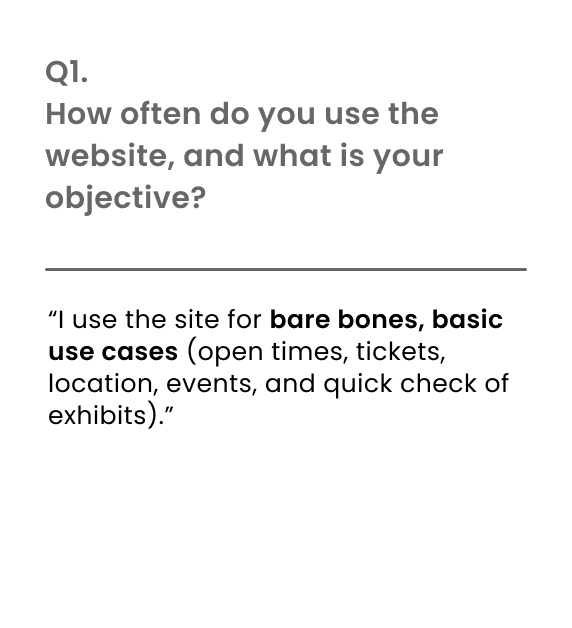
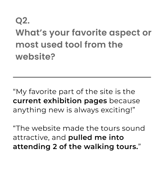
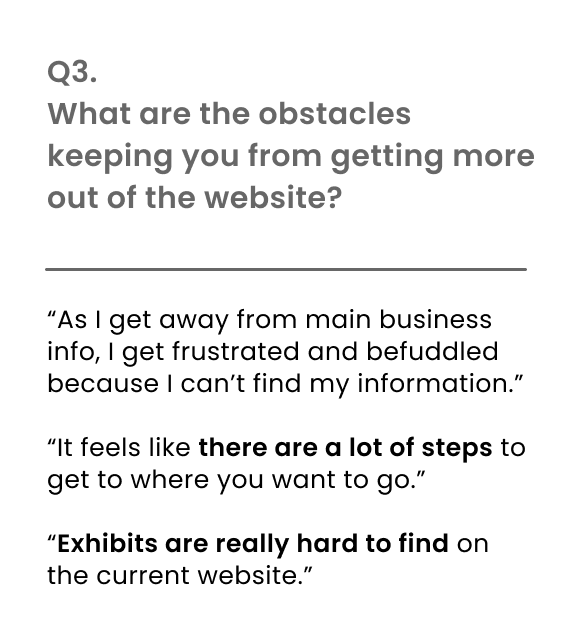
The goals of these interviews were to understand the needs of our users, how they use the WLM’s website, and uncover any pain points they were experiencing.
Survey Insights
We conducted a survey to learn more about where our audience were coming from and how they discovered the WLM.
Web Analytics
The in between pages for ‘The Museum’ and ‘Join & Give’ takes you to a page that is just tabs and without further information.
’Join & Give’ has an exit rate of 10%.
The higher exit rate may be explained by the extra step needed for users to accomplish their task, or the users may not have been able to find what they’re looking for.
’The Museum’ page has the same issues as the ‘Join & Give’ page where the exit rate is at 8.33% (847 users). This page had no information and didn't allow our users to discover information immediately, thus causing them to gave up seeking additional information at this stage.
Top 10 Most Viewed Pages
We discovered the top 10 most trafficked pages and plan on focusing on these pages on our main navigation or diving deeper into what might have made these pages more popular than others.
- Percentage of Pageviews vs Total Traffic (May 1, 2022 - Aug 31, 2022)
Getting To Know the Industry
Feature Inventory
In order to better understand museum websites with a similar customer base to the WLM, I performed a Feature Inventory focused on five of the museums competitors: The Metropolitan Museum of Art, Museum of Pop Culture, Seattle Art Museum, Asian Art Museum, and the Japanese American National Museum.
Clearly, the WLM’s website is missing many of the features that their competitors offer. But not all features are necessary or desired by visitors, so I conducted more research to see what visitors want to see on a museum’s webpage.
Competitor Element Analysis
From this visual portion of the Feature Element Analysis, there is an observable difference in the distribution of information. So we found that more information was distributed throughout the main navigation and the body of the home page for our three competitors. The MET, MoPOP and the Asian Art Museum have more information in their main navigation body of the landing page. The Wing Luke Museum has less information distributed in its main navigation and body. The Wing, Luke's footer, which is almost half the size of the homepage, contains the majority of their information. Whereas with The MET and MoPOP, the footer is more condense and doesn't make up half the page.
Main Takeaways:
More information distributed throughout the head navigation and body of landing page
Footer reserved for niche information
Define
Affinity Mapping
The Affinity Map illustrated the most common user observations, which we used to build out our hypothesis and user insights. The results reaffirmed our users’ main goals when when planning their visit to a museum. Therefore our feature strategy will address the site’s information architecture to ensure users have confidence in finding the information that they need to plan their visit to the Wing Luke Museum.
The Challenge: Revamp the website’s information architecture to make points of interest more accessible to users.
Problem Statement: Our visitors need a way to view information about WLM’s current offerings more efficiently because they want to be updated on exhibits/events, but find that the current website is difficult to navigate around.
How Might We:
Reduce the user’s exhaustion during the searching process?
Cater to different audiences that WLM attracts on a daily basis?
Make the website more inviting to make the users feel better valued?
Navigation
Lets Take A Look At The Information Architecture
For this website redesign, I wanted to focus on the information architecture. In order to grasp the scale of the amount of information offered by the WLM, I mapped everything out from our main navigation and the footer.
Current State Site Map
In this gallery you’ll get a visual depiction on the vast amount of information that the WLM has to offer, organized into 4 tabs in the main navigation.
Proposed State Site Map
Here is the new proposed state site map. You can tell right away visually that it is not as information dense as the current state. We focused on what our personas wanted to accomplish when seeking information on the WLM site and insights from our competitive and comparative analysis to create a site map that was more straightforward and intuitive to use. In the main navigation we almost reorganized everything, ‘Shop’ is the only category that has been untouched. Users felt overwhelmed with the large amount of text that was in the footer and it’s overall size. We believe this new layout will allow better accessibility and scannability.
Navigation
Header: The new header design featuring an updated site map, clear navigation categories and an Asian American inspired seigaiha pattern, allows users to quickly find the information they need, reducing the need to search through other means or call the museum. This redesign was aimed at decreasing the bounce rate and improving the overall user experience. A search bar was also added to the header to make it even easier for users to find what they are looking for.
Footer: The new footer design for this project keeps all the content previously found in the large footer but utilizes a more compact layout, taking up less vertical space and making it more scannable for users. This was achieved by rearranging the elements and using a more minimalistic design approach.
Design Iteration
Usability Testing
Lets Summarize What The Visitors Had to Say
With an iterative design approach, we conducted two usability tests - one for the mid-fidelity prototype and one for the high-fidelity prototype. The results were overwhelmingly positive, with all participants finding the redesigned navigation menu intuitive and easy to use. However, some suggested more descriptive content for the museum exhibits and tours and additional pops of color for visual appeal.
High-Fidelity Usability Testing
Tasks:
1. Find visitation information & ticket pricing
2. Find the exhibits page and food tours page
3. Find the museum’s directory
Key Insights:
5 of 5 visitors had no trouble spotting the buttons, and expressed excitement over the pops of color and increased visual interest (navigation Seigaiha patterning)
3 of 5 visitors reported wanting more descriptors under museum exhibit and tour content.
4 of 5 visitors expressed feeling welcomed by the site, but would appreciate more pops of color for visual interest.
5 of 5 users were able to complete each task in 2 minutes or less.
Success Metrics
Design
The Final Prototype
A New Home Page
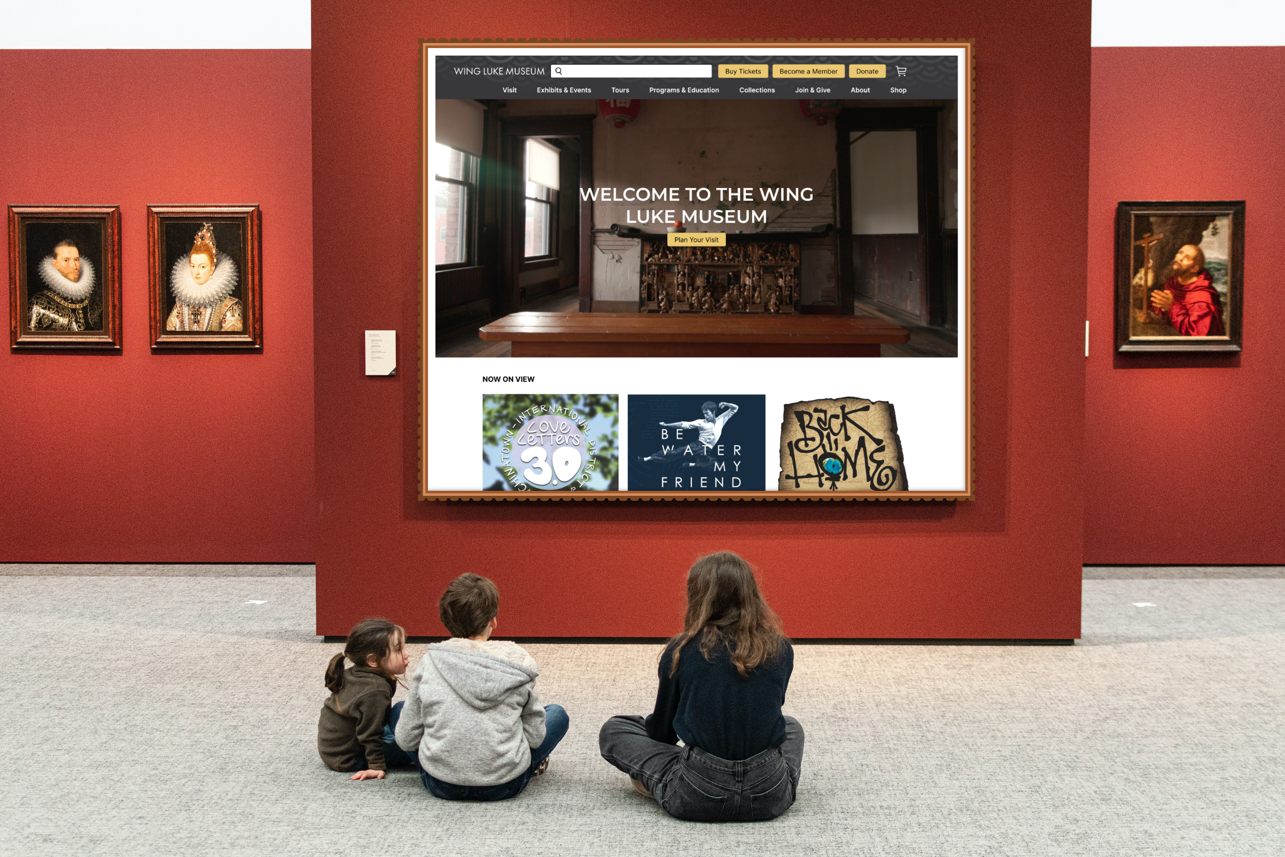
The home page now includes more information, as discovered through competitive and comparative analysis of other museums and nonprofits. This new design allows for a more intuitive navigation menu with clear categories, making it easier for users to find the information they need. The added content on the page also allows new visitors to discover more about the website in fewer clicks, improving their overall experience.
Condensed Hero Image: The new hero image is more condensed and features updated copy, clearly inviting users to "Plan Your Visit" for a more welcoming and user-friendly landing page experience.
More Detailed Exhibits: The redesign of the exhibit display now includes information on the duration of each exhibit, as identified through user feedback during usability testing. This allows visitors to better plan their visit and make the most of limited-time exhibits.
Updated Page Body & Content: The new home page features a more comprehensive display of content, tours, events, and opportunities, in line with industry standards and as identified through our competitive analysis. This allows users to easily discover and explore all that the Wing Luke Museum has to offer.
Discover Exhibits With Ease
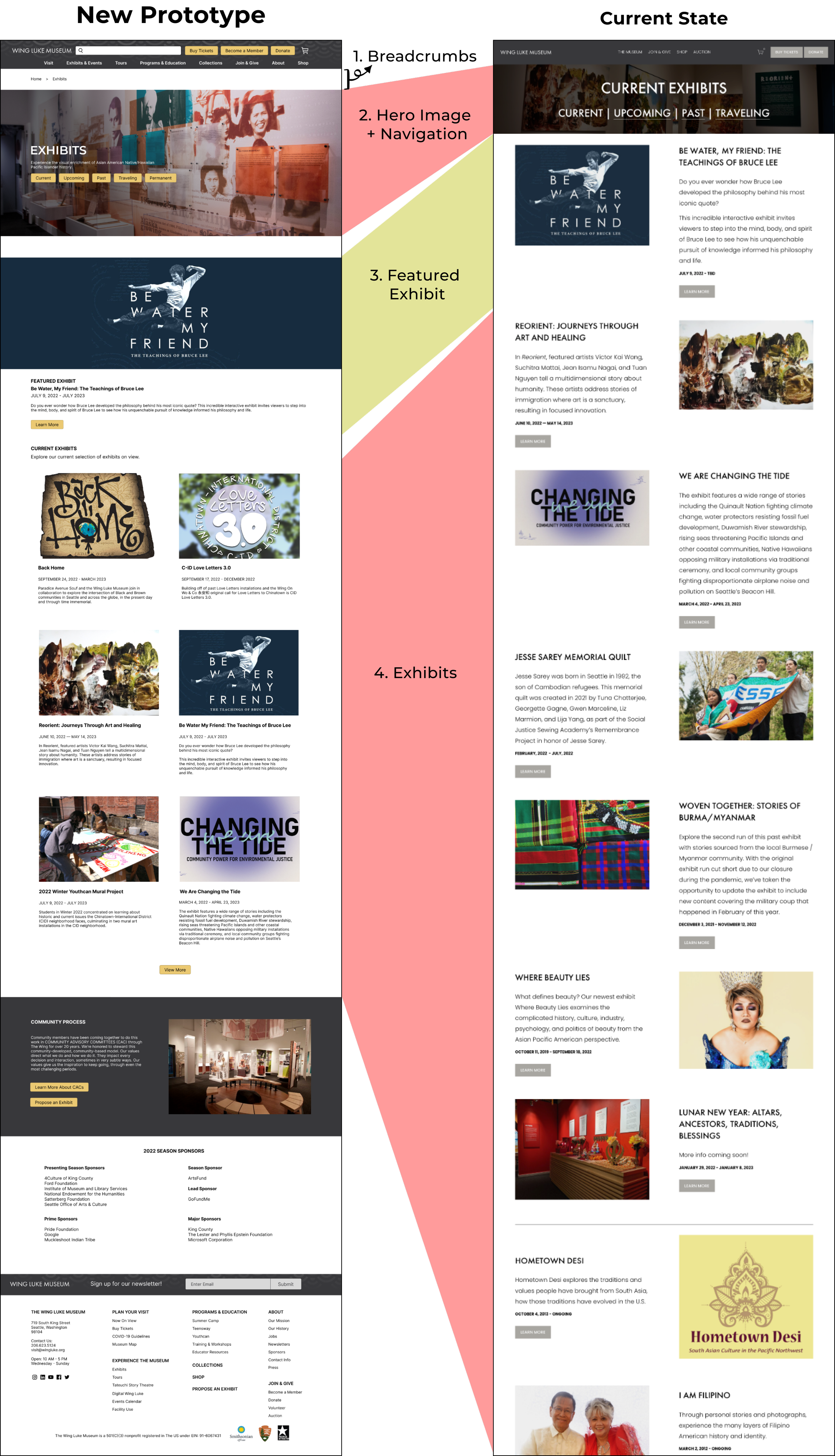
The new exhibits page not only features a clear and organized layout, making it easy to discover the latest and past exhibits, but also allows users to directly access the exhibits without navigating through an unnecessary page, like the old 'The Museum' page which had no content.
Breadcrumbs: With the addition of breadcrumbs in the navigation, users can easily track their location within the website and navigate back to previous pages with ease.
Hero Image + Navigation: The new hero image at the top of the page effectively connects users to the museum and provides clearer navigation.
Featured Exhibit: The exhibits page now features a rotating hero section at the top, highlighting the latest or most promoted exhibit for easy visibility and engagement.
Exhibits: The new exhibits page features a more condensed layout with a clear hierarchy, making it easier for users to read and find information, while also improving SEO and page loading speeds by limiting the number of featured exhibits to 6 at a time.
Planning Your Visit
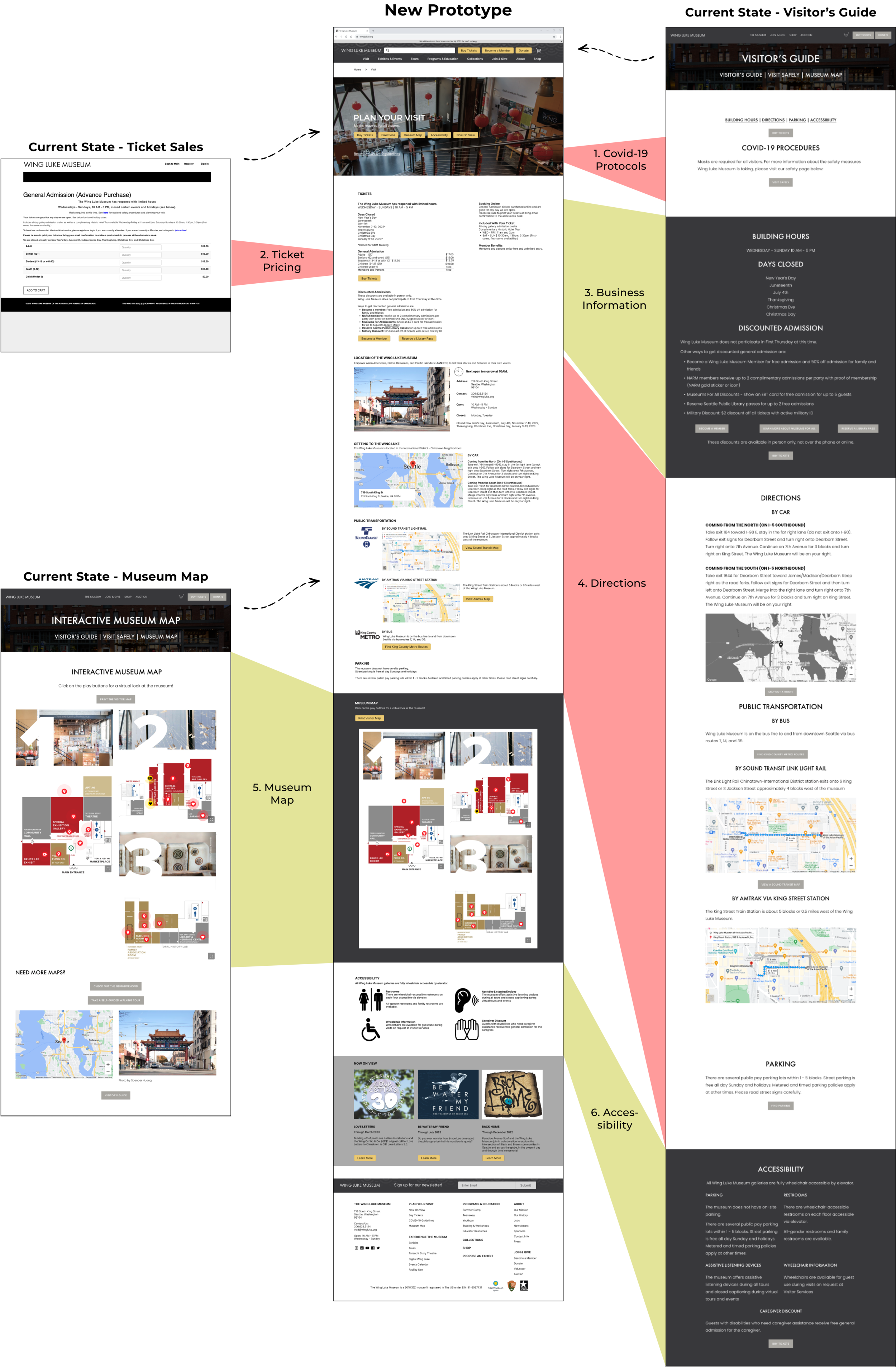
The new 'Plan Your Visit' page consolidates all the information regarding planning a visit to the museum, making it easier for users to find the information they need. This page incorporates three previously separate pages, such as Tickets, Visitor’s Guide and Museum Maps, into one easy-to-use page. This new design allows for a more seamless user experience and makes it easier for visitors to plan their trip to the museum.
Covid-19 Protocols: COVID-19 protocols are still at the top of the page, but it takes up less space on the website, while still highlighting the importance of these procedures.
Ticket Pricing: The new website now features clear and upfront ticket pricing, making it easy for visitors to plan and budget their visit to the museum. This change was made based on feedback from usability testing where users had difficulty finding pricing information.
Business Information: The business information is more consolidated and easy to scan, making it more user-friendly, and the address is now prominently displayed on the homepage, rather than being hidden in the footer.
Directions: The directions to the museum are now more consolidated and include logos of different public transit options to make it easier for visitors to find their way to the museum.
Museum Map: The "Plan Your Visit" page now prominently displays an interactive museum map, which was previously difficult to find, based on feedback from user interviews. This makes it easier for visitors to navigate the museum and plan their visit.
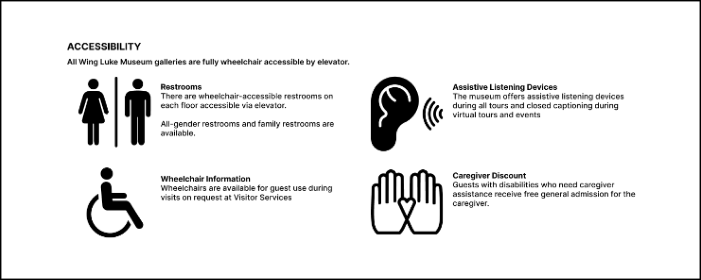
6. Accessibility: The new accessibility information feature now includes icons to help users quickly understand what is available, making it more visually accessible and user-friendly for non-native English speakers.
Take A Step Into The Prototype
Next Steps
Improving Functionality: What's Next?
Build out pages for donations, education, and the online store to improve user experience and increase conversion rates.
Optimize the site for mobile devices to provide a seamless experience for users on the go.
Monitor site performance metrics such as exit rates, conversion rates, and bounce rates to gauge the success of the redesign and make necessary adjustments.
Check out the Figma prototype of the Wing Luke Museum website redesign.
Reflection
This project was incredibly meaningful to me as an Asian American. Being able to work on a redesign for the Wing Luke Museum, an Asian American history museum, was a powerful experience. I felt connected to the AANHPI community in a new way and felt like I was giving back to the community through my work. Additionally, researching and learning more about Asian American history in the Pacific Northwest was a valuable and enlightening experience. Overall, this project was a powerful reminder of the importance of preserving and sharing the stories of marginalized communities. It was an honor to be a part of this work.
Thanks for reading! If you want to collaborate, talk about UX Design, or want to say hello, find me at aaron.l.yeung@gmail.com or connect via LinkedIn.


