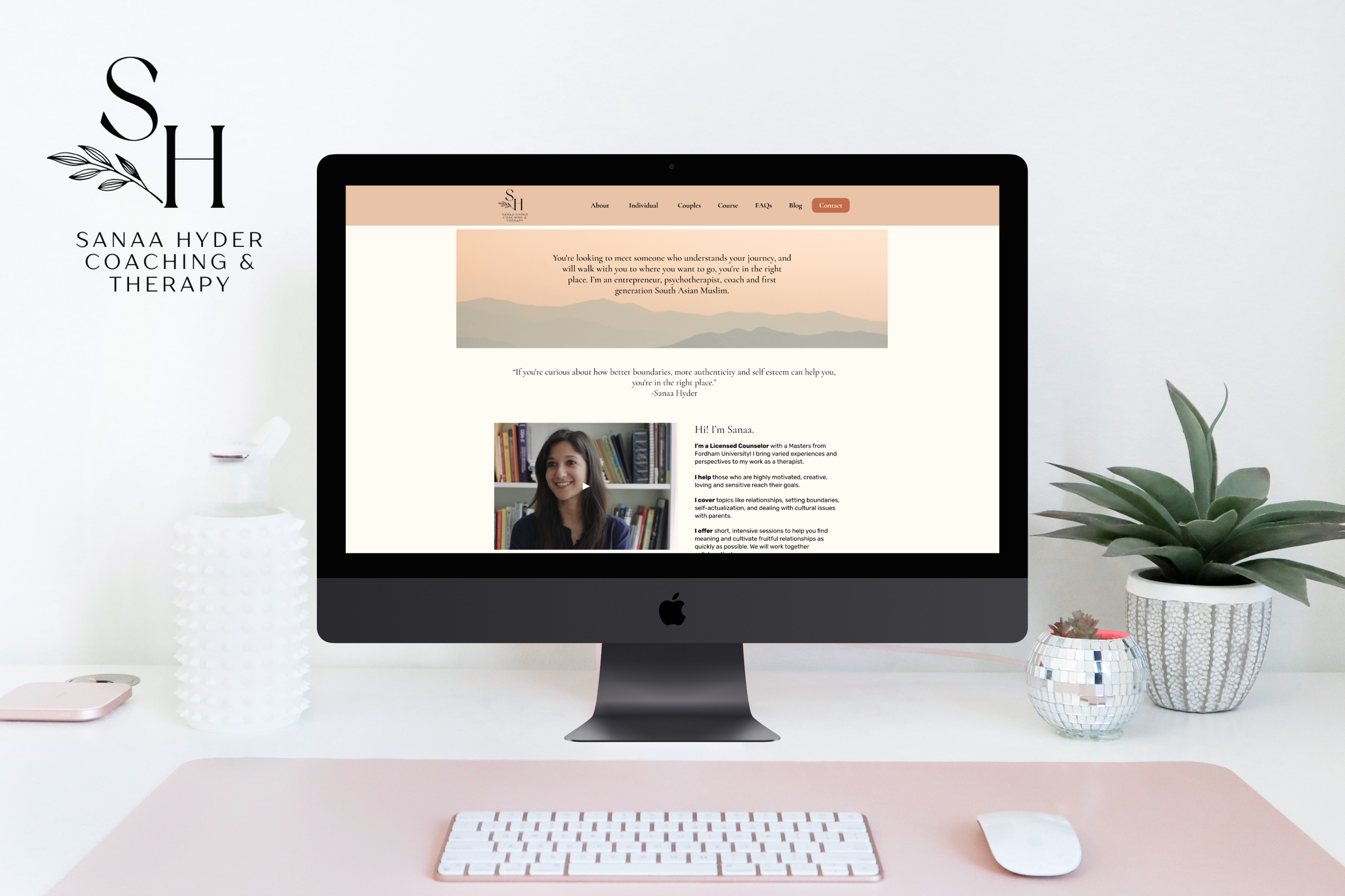
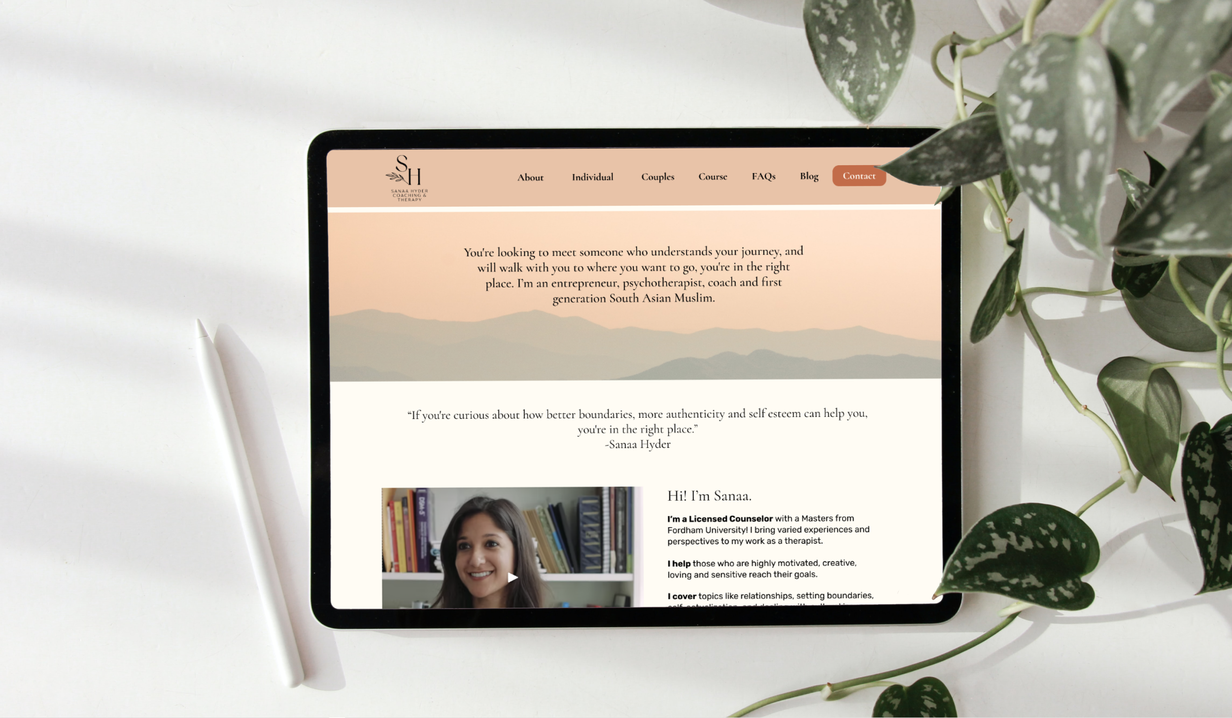
Sanaa Hyder: Therapy & Coaching
A Journey To Love Yourself
Sanaa Hyder: Therapy & Coaching
ROLE
Lead UX Designer, UX Researcher
TEAM
UX/UI Designer - Trev Peacock
UX/UI Designer & Researcher - Lexi Dong
UX Designer - Haya Joshi
TIMELINE
June 2022 - July 2022
TOOLS
Pen & Paper, Figma, Canva, Slack, Zoom, Microsoft Teams
METHODS
Survey, Competitive Analysis, Comparative Analysis, User Interviews, Affinity Mapping, User Persona, User Flow, Sketches, Sitemap, Grayscale Wireframe, High Fidelity Wireframe, Usability Testing
OVERVIEW
Sanaa Hyder Therapy & Coaching is a private practice led by Sanaa Hyder, an entrepreneur, psychotherapist, coach, and first-generation South Asian Muslim. It offers unique relationship and individual counseling to help motivated and creative individuals reach their goals, using an integrated approach that draws on interpersonal neurobiology and attachment patterns, setting it apart from other therapy providers in the area.
The project was a redesign of a therapy and life coaching website for a private practice. The goal was to improve website traffic and increase sales conversion of the therapy practice's online course. The team conducted extensive research and developed a responsive website redesign, focusing on building trust and making it easy for users to find the right service. The website also included inclusive elements to ensure users felt represented.
MY ROLE
As the lead UX Designer, I played a crucial role in guiding the research and design efforts of the team throughout the project. I was responsible for leading the planning initiative to ensure that the 3-week sprint was completed on time. Additionally, I executed the design and development of interactive components of the prototype, developed a comprehensive style guide and implemented detailed features to ensure that the final product met the core needs of both the client and users. I was responsible for ensuring that the redesign project was user-centered and met the business objectives.
The Challenge
The challenge was to redesign the therapy and life coaching website for Sanaa Hyder's private practice, targeting South Asian females between the ages of mid-20s to mid-40s in the New York/New Jersey area who are seeking therapy and/or life coaching. The focus was on improving web analytics performance metrics, information architecture, and UX copy to provide an enlightening and engaging online experience that would encourage users to explore mental health services. Despite having established her practice online with Squarespace, the current website was not generating the desired level of traffic and engagement from the target audience.
Sanaa Addressed Some Concerns
Before we started our research phase to gain insights on her users, we had our kickoff meeting with Sanaa Hyder herself and she addressed some concerns she had about her page and her site goals.
She address concerns that the bounce rate of her site was high. Approximately 60%.
If her target audience can find her webpage through organic search, and could they then find what they needed once they discover her webpage?
Why weren’t her online therapy course converting any sales?
Could the site be better optimized for paid and organic search?
Solution Overview
Our team redesigned a responsive website that provided an intuitive and easy way to find the mental health service that best suits users. It aimed to establish trust and confidence with new users and increase awareness of the 'Ultimate Therapy Prep Course'.
Research
Competitive Analysis
Successful competitors do a lot of things differently
We analyzed 3 therapy websites—Michelle Harwell Therapy, Minaa B Consulting, Midtown MFT—to gather useful insights about what make them successful in the field.
We found out that they share a lot of similarities:
personal branding is evoked through the right combination of fonts and colors
legitimacy and trustworthiness is built by presenting testimonials and reviews
copy is broken up in a visually dynamic way for better readability
call to action is strong and powerful
navigation is straightforward and clear
Comparative Analysis
Course examples help people understand what to expect
Sanaa wanted to attract more users to sign up for her ‘Ultimate Therapy Prep Course”. We conducted a comparative analysis with some well-recognized courses with different products/service types — Guitar Super System, Chloe Ting, Master Class—to gain insights. They all have something in common, they give users a landing page with important information as to what their courses entail and what they offer, including structure/lessons of the courses and previews or examples.
Web Analytics - Google Analytics
Sanaa especially mentioned that she was bothered by the high bounce rate, so we dug into google analytics data of 2021 and 2020.
The total users increased by 35%; but the number of sessions per user, average duration, and bounce rate has stayed relatively the same.
With number of sessions per user at 1.16, it means that users are only looking at one page and not exploring further on the site, such as the course and services pages.
With a bounce rate of 87% either users found everything they need or couldn’t find the information that they needed. It would be unlikely users on the homepage have found that they want since the page does not have any direct contact information or business information.
User Interviews
We conducted 17 user interviews. For a topic that can be sensitive to some users, we wanted to collect more qualitative data regarding what users might seek when nit comes to a mental healthcare professional and their thoughts on mental health overall. Constrained by client confidential, we were not able to access Sanaa’s clients for user interviews. We started by reaching out to people in our personal networks as well as a few classmates who have openly discussed interest in the topic of mental health. We targeted users who fit the target demographic of South Asian women of which 70% of our participants fell into Sanaa’s target demographic.
Questions We Asked
What makes you trust a healthcare provider?
Overall opinion on mental health?
What makes you trust a mental healthcare provider’s website?
What factors do you consider when deciding on a mental health professional?
Main Takeaways
Synthesizing the interview insights to the most prominent trends, here is what our users had to say:
TRANSPARENCY
“I want to learn about the process before committing”
TRUST
“I want website features that display credibility & trustworthiness”
VALUE OTHER USERS OPINIONS
“I value client reviews when choosing a therapist”
QUALIFIED
“I prefer choosing a therapist with adequate experience”
SIMILAR BACKGROUND
“I feel more comfortable with a therapist who shares the same background as me as they already understand the dynamics of my culture/ background”
CREDENTIALS & CERTIFICATION
“I search for qualifications and certifications when choosing a mental health care professional”
EMPATHY
“I would like to find a genuine and personable mental health care professional”
Define
Meet Our Persona
With these user insights and feelings in mind, we created our persona - “The Well-Being Seeker”. The well-being seeker is a South Asian professional who has immigrated and assimilated to the United States while still being tied strongly to her eastern roots emotionally and culturally. She is frustrated that she can’t find easily find a qualified therapist that has a similar background as her.
What’s The Problem?
The Well-Being Seeker needs an efficient way to find a reliable, trustworthy, qualified mental healthcare professional who can relate to their backgrounds culturally and emotionally so that they can receive adequate care.
How Might We?
How might we help find a trustworthy potential healthcare professional?
How might we help users understand the mental healthcare process before committing to service?
How might we help users find mental healthcare professionals with similar culture/background as them?
How might we help users locate the factors they value when deciding on a mental healthcare professional easily and efficiently?
How might we help users get in touch with potential mental healthcare professionals easily?
The Solution
The solution was a redesign of the responsive website that focused on three key services: Individual Therapy, Couples Therapy, and the Ultimate Therapy Prep Course. The goal was to create a user-friendly website that helped users find the service that best suited their needs, and to build trust with new users. The website was designed with the ability for users to easily browse individual services, and filter out irrelevant information.
Design
Style Guide
Prototyping
Four Major Improvements On Usability
Based on our research and insights from our users, we iterated our design with 4 major design changes.
1) Navigation needed improvement (Header & Footer) - Information Architecture
The Header was inconsistent, we made additions to the main navigation and kept the header consistent throughout the webpage.
The Footer’s lack of contrast made the items difficult to read. We created a new footer with better readability and added navigation and contact information.
2) Breaking up different types of Services
On current state usability testing, users preferred to learn more about Sanaa before deciding on newsletter sign-up. Thus, we lowered the sign-up section.
But on this round of testing, users were confused that why there were two sign-ups on the home page; and they were wondering if these two sign-ups were different because they were too close to each other. We relocated one sign-up higher up.
3) Making Frequently Asked Questions (FAQs) Accessible
The FAQs were in under the ‘Services’ page and users had difficulty finding important information on the bottom of the ‘Services’ page.
We broke the FAQs into its own page and added it to the main navigation. Thus, making the questions our users needed more accessible.
4) Creating Trust and Displaying Credibility when searching for a mental health professional
After the first 2 rounds of usability testing. Users wanted to see qualifications and credentials prominently displayed and easy to find. That was the most important factor when users were seeking a mental healthcare professional.
1) Header & Footer
The Header was inconsistent as there were multiple iterations of it on different pages. The new Header features warmer colors and greater contrast with the ‘Contact’ button for improved accessibility.
The original Footer lacked contrast which made it difficult to read and lacked basic navigation, and business information.
2) SERVICES & 3) FAQs
2) Breaking up different types of Services
On current state usability testing, users preferred to learn more about Sanaa before deciding on newsletter sign-up. Thus, we lowered the sign-up section.
But on this round of testing, users were confused that why there were two sign-ups on the home page; and they were wondering if these two sign-ups were different because they were too close to each other. We relocated one sign-up higher up.
3) Making Frequently Asked Questions (FAQs) Accessible
The FAQs were in under the ‘Services’ page and users had difficulty finding important information on the bottom of the ‘Services’ page.
We broke the FAQs into its own page and added it to the main navigation. Thus, making the questions our users needed more accessible.
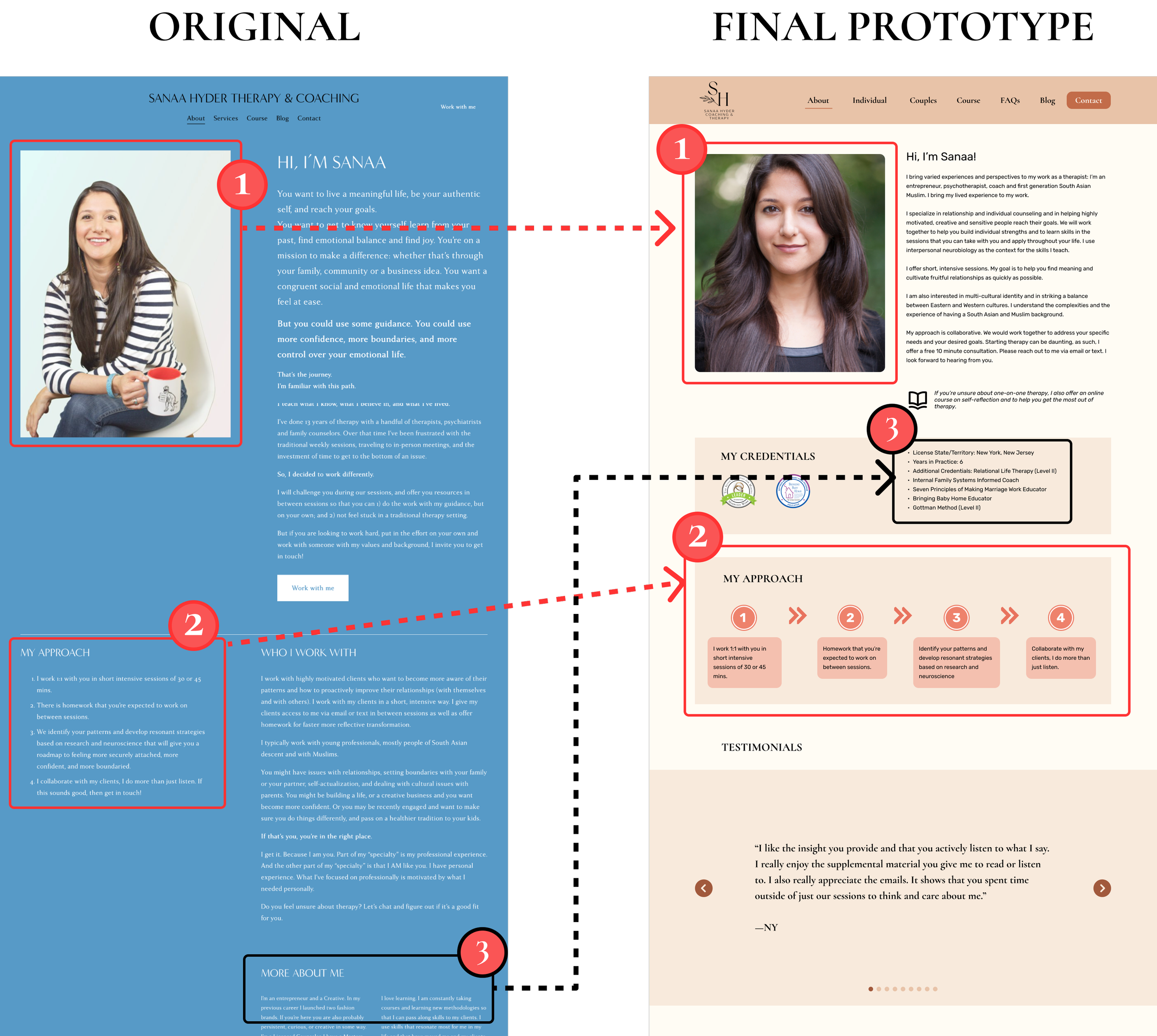
4) About Me - Building Trust
After the first 2 rounds of usability testing. Users wanted to see qualifications and credentials prominently displayed and easy to find. That was the most important factor when users were seeking a mental healthcare professional.
Users wanted to see a more professional headshot. They felt a more professional headshot added trust and credibility.
More experienced users wanted to learn about Sanaa’s approach but was difficult to find on the original site. In our final prototype, we displayed her approach in four clear steps.
In the original ‘About’ page, there was a ‘More About Me’ section that had a lot of important information regarding Sanaa’s credentials. We took that and in the final prototype, we displayed those skills with confidence and prominently. This will make users feel more at ease knowing that Sanaa has the skills and credentials on potentially becoming their mental healthcare provider.
A/B TESTING
5 out of 7 users preferred illustrations to real photos
Our research indicated that users, specifically women of color, preferred illustrations over images as they felt that they were able to see themselves more accurately represented in illustrations. This played a crucial role in our redesign as we incorporated illustrations into the website, making it more professional and modern, and ensuring that it resonated with our target audience. This was an important consideration in our design process as it helped to create a sense of inclusivity and belonging for our users, which is particularly important when it comes to addressing mental health concerns.
6 out of 7 users preferred the testimonials on the home page
The majority of people thought the homepage is where the testimonials belonged.
Experience The Redesign For Yourself
Next Steps
What Can We Do Next?
Conduct usability tests on the mobile and tablet versions of the website to ensure that the needs of our users are met on different devices as their needs might change when they are not on a desktop computer.
Monitor Google Analytics to see if the bounce rate decreases and other key web analytics performance metrics after changes have been implemented on SanaaHyder.com. Monitor an increase in site traffic through organic search.
Online Therapy Course - We can continue to measure traffic and further develop the course to be mobile friendly .
Takeaways
The importance of primary research: The user research conducted during the project helped inform design decisions and features, and ultimately led to a more user-centered solution.
The value of a design system: Developing a design system that included a color palette, typography, and UI elements helped to establish a consistent visual language throughout the website, resulting in a more polished and professional final product.
The impact of representation: The users' preference for illustrations over images in representing themselves, particularly women of color, was a valuable insight that was incorporated into the redesign to make the website more inclusive and relatable to the target audience.
Reflection
This project was a valuable learning experience in understanding the importance of mental health and the role of therapy in addressing it. The redesign of the therapy and life coaching website for Sanaa Hyder's private practice was an opportunity to learn about the unique challenges and considerations that come with addressing mental health issues. Through research, I discovered that many individuals struggle to find the right mental health service for them and that building trust with new users is crucial. Additionally, I learned that representation is a key consideration when it comes to addressing mental health concerns, particularly for women of color.
During the project, I also gained a deeper understanding of the importance of tailoring mental health services to individual needs and the value of an integrated approach that draws on interpersonal neurobiology and attachment patterns. Additionally, I learned how to create a user-friendly website that could help users find the right service and support they needed. This project also helped me understand how to make sure the website was inclusive, so users could feel represented and see themselves in the website.
Overall, this project was an eye-opening experience and helped me understand the importance of mental health, the role of therapy and how to design a website that could support users in finding the right service.
Thanks for reading! If you want to collaborate, talk about UX Design, or want to say hello, find me at aaron.l.yeung@gmail.com or connect via LinkedIn.


